Blog components
Components associated with the blog/news section of the website.
The featured post components integrate the third-party Glightbox plugin to enable video popup functionality.
Ensure that you include the necessary references to the plugin's CSS and JavaScript files.
CSS file is linked in the <head> section and above theme.min.css reference in your document:
<link rel="stylesheet" href="assets/vendor/glightbox/dist/css/glightbox.min.css">JavaScript file is linked before the closing </body> tag and above theme.min.js reference in your document:
<script src="assets/vendor/glightbox/dist/js/glightbox.min.js"></script>Post preview card: Vertical
<!-- Vertical post preview cards: Grid view -->
<!-- Variant 1 -->
<article>
<!-- Wrap the image with a "ratio" element to avoid content shifts on page load. Formula: imageHeight / imageWidth * 100% -->
<a class="ratio d-flex hover-effect-scale rounded-4 overflow-hidden" href="#" style="--cz-aspect-ratio: calc(305 / 416 * 100%)">
<img src="assets/img/blog/grid/v1/10.jpg" class="hover-effect-target" alt="Image">
</a>
<div class="pt-4">
<div class="nav align-items-center gap-2 pb-2 mt-n1 mb-1">
<a class="nav-link text-body fs-xs text-uppercase p-0" href="#">Gaming</a>
<hr class="vr my-1 mx-1">
<span class="text-body-tertiary fs-xs">July 27, 2024</span>
</div>
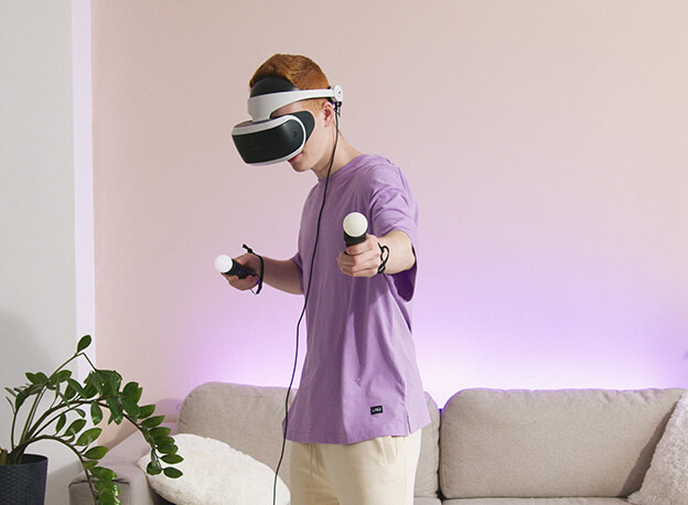
<h3 class="h5 mb-0">
<a class="hover-effect-underline" href="#">Immersive worlds: A dive into the latest VR gear and experiences</a>
</h3>
</div>
</article>
<!-- Variant 2 -->
<article>
<!-- Wrap the image with a "ratio" element to avoid content shifts on page load. Formula: imageHeight / imageWidth * 100% -->
<a class="ratio d-flex hover-effect-scale rounded-4 overflow-hidden" href="#" style="--cz-aspect-ratio: calc(466 / 636 * 100%)">
<img src="assets/img/blog/grid/v2/07.jpg" class="hover-effect-target" alt="Image">
</a>
<div class="pt-4">
<div class="nav pb-2 mb-1">
<a class="nav-link text-body fs-xs text-uppercase p-0" href="#">Interior design</a>
</div>
<h3 class="h5 mb-3">
<a class="hover-effect-underline" href="#">Feng shui your home: Interior design tips for positive energy</a>
</h3>
<div class="nav align-items-center gap-2 fs-xs">
<a class="nav-link text-body-secondary fs-xs fw-normal p-0" href="#">Emily Davies</a>
<hr class="vr my-1 mx-1">
<span class="text-body-secondary">June 27, 2024</span>
</div>
</div>
</article>Post preview card: Horizontal
How to find the best deals and make secure transactions online
This blog post will guide you through the dual objectives of snagging great bargains and protecting your financial...
<!-- Horizontal post preview cards: List view -->
<article class="row align-items-start align-items-md-center gx-0 gy-4">
<div class="col-sm-5 pe-sm-4">
<!-- Wrap the image with a "ratio" element to avoid content shifts on page load. Formula: imageHeight / imageWidth * 100% -->
<a class="ratio d-flex hover-effect-scale rounded overflow-hidden flex-md-shrink-0" href="#" style="--cz-aspect-ratio: calc(226 / 306 * 100%)">
<img src="assets/img/blog/list/07.jpg" class="hover-effect-target" alt="Image">
</a>
</div>
<div class="col-sm-7">
<div class="nav align-items-center gap-2 pb-2 mt-n1 mb-1">
<a class="nav-link text-body fs-xs text-uppercase p-0" href="#">Buying guides</a>
<hr class="vr my-1 mx-1">
<span class="text-body-tertiary fs-xs">August 18, 2024</span>
</div>
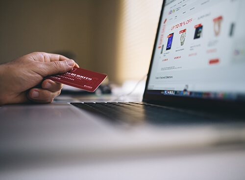
<h3 class="h5 mb-2 mb-md-3">
<a class="hover-effect-underline" href="#">How to find the best deals and make secure transactions online</a>
</h3>
<p class="mb-0">This blog post will guide you through the dual objectives of snagging great bargains and protecting your financial...</p>
</div>
</article>Vlog card
<!-- Video blog (Vlog) post preview card -->
<article class="hover-effect-scale position-relative mb-2" style="max-width: 306px">
<!-- Wrap the image with a "ratio" element to avoid content shifts on page load. Formula: imageHeight / imageWidth * 100% -->
<div class="ratio rounded overflow-hidden" style="--cz-aspect-ratio: calc(200 / 306 * 100%)">
<div class="btn btn-icon btn-light position-absolute top-50 start-50 translate-middle z-2 rounded-circle pe-none">
<i class="ci-play fs-base"></i>
</div>
<img src="assets/img/blog/grid/v1/video01.jpg" class="hover-effect-target" alt="Image">
</div>
<div class="pt-3 mt-1">
<div class="text-body-tertiary fs-xs mb-2">06:12</div>
<h3 class="h6 mb-0">
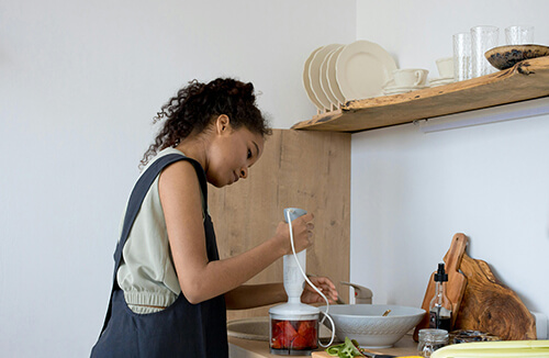
<a class="hover-effect-underline stretched-link" href="#">A comprehensive review of the latest kitchen blenders on the market</a>
</h3>
</div>
</article>Featured post: Variant 1
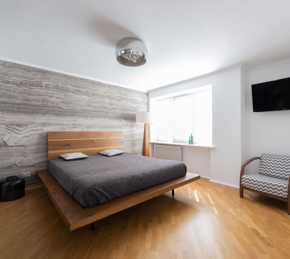
Decorate your home in easy steps
Decorating your home can be a fun and creative process that transforms your living space.
Learn more<!-- Featured post with video popup -->
<div class="row row-cols-1 row-cols-md-2 g-0 overflow-hidden rounded-5">
<!-- Video -->
<div class="col position-relative">
<!-- Add the "ratio" element to avoid content shifts on page load -->
<div class="ratio ratio-4x3"></div>
<img src="assets/img/blog/grid/v2/video01.jpg" class="position-absolute top-0 start-0 w-100 h-100 object-fit-cover" alt="Image">
<div class="position-absolute start-0 bottom-0 d-flex align-items-end w-100 h-100 z-2 p-4">
<a class="btn btn-lg btn-light rounded-pill m-md-2" href="https://www.youtube.com/watch?v=X7lCwxswYnE" data-glightbox data-gallery="video">
<i class="ci-play fs-lg ms-n1 me-2"></i>
Play
</a>
</div>
</div>
<!-- Title + text -->
<div class="col bg-dark py-5 px-4 px-xl-5" data-bs-theme="dark">
<div class="py-md-2 py-xl-4 px-md-3 px-xl-4">
<div class="nav mb-3">
<a class="nav-link text-body fs-xs text-uppercase p-0" href="#">Home decoration</a>
</div>
<h2>Decorate your home in easy steps</h2>
<p class="text-body pb-sm-2 pb-lg-0 mb-4 mb-lg-5">Decorating your home can be a fun and creative process that transforms your living space.</p>
<a class="btn btn-lg btn-outline-light rounded-pill" href="#">Learn more</a>
</div>
</div>
</div>Featured post: Variant 2
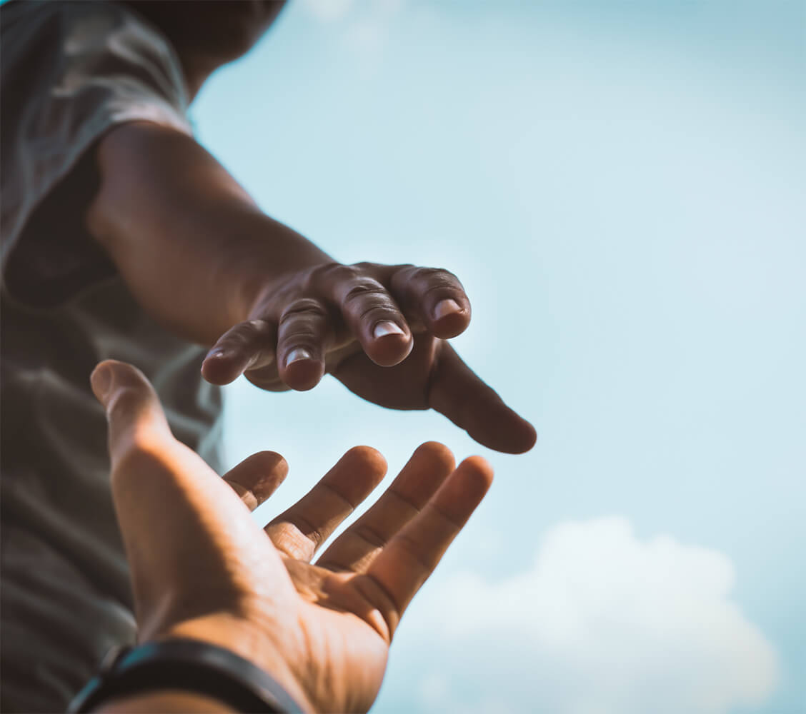
The role of philanthropy in building a better world
Charitable contributions are a vital aspect of building a better world. These contributions come in various forms...
Learn more<!-- Featured post with video popup -->
<div class="row row-cols-1 row-cols-md-2 g-4">
<div class="col">
<div class="position-relative h-100">
<!-- Add the "ratio" element to avoid content shifts on page load -->
<div class="ratio ratio-16x9"></div>
<img src="assets/img/about/v1/video-cover.jpg" class="position-absolute top-0 start-0 w-100 h-100 object-fit-cover rounded-5" alt="Image">
<div class="position-absolute start-0 bottom-0 d-flex align-items-end w-100 h-100 z-2 p-4">
<a class="btn btn-lg btn-light rounded-pill m-md-2" href="https://www.youtube.com/watch?v=Sqqj_14wBxU" data-glightbox data-gallery="video">
<i class="ci-play fs-lg ms-n1 me-2"></i>
Play
</a>
</div>
</div>
</div>
<div class="col">
<div class="bg-body-tertiary rounded-5 py-5 px-4 px-sm-5">
<div class="py-md-3 py-lg-4 py-xl-5 px-lg-4 px-xl-5">
<h2 class="h3 pb-sm-1 pb-lg-2">The role of philanthropy in building a better world</h2>
<p class="pb-sm-2 pb-lg-0 mb-4 mb-lg-5">Charitable contributions are a vital aspect of building a better world. These contributions come in various forms, including monetary donations...</p>
<a class="btn btn-lg btn-outline-dark" href="#">Learn more</a>
</div>
</div>
</div>
</div>Post navigation

<!-- Post navigation -->
<div class="border-top">
<!-- Previous post -->
<div class="nav flex-nowrap align-items-center justify-content-between gap-4 pt-3">
<a class="nav-link flex-wrap flex-sm-nowrap justify-content-center position-relative w-50 p-0" href="#" style="max-width: 330px">
<div class="d-flex align-items-center mb-2 mb-sm-0">
<i class="ci-chevron-left fs-xl ms-n3 ms-sm-n1 me-2"></i>
<!-- Wrap the image with a "ratio" element to avoid content shifts on page load. Formula: imageHeight / imageWidth * 100% -->
<div class="ratio flex-shrink-0" style="width: 86px; --cz-aspect-ratio: calc(64 / 86 * 100%)">
<img src="assets/img/blog/post/nav01.jpg" class="rounded-2" alt="Image">
</div>
</div>
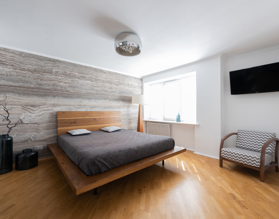
<div class="h6 fs-sm hover-effect-underline stretched-link text-center text-sm-start mb-0 ps-3">How modern technology builds communities</div>
</a>
<!-- Next post -->
<a class="nav-link flex-wrap flex-sm-nowrap justify-content-center position-relative w-50 p-0" href="#" style="max-width: 330px">
<div class="d-flex align-items-center order-sm-2 mb-2 mb-sm-0">
<!-- Wrap the image with a "ratio" element to avoid content shifts on page load. Formula: imageHeight / imageWidth * 100% -->
<div class="ratio flex-shrink-0" style="width: 86px; --cz-aspect-ratio: calc(64 / 86 * 100%)">
<img src="assets/img/blog/post/nav02.jpg" class="rounded-2" alt="Image">
</div>
<i class="ci-chevron-right fs-xl me-n3 me-sm-n1 ms-2"></i>
</div>
<div class="h6 fs-sm hover-effect-underline stretched-link text-center text-sm-end order-sm-1 mb-0 pe-3">Transform your home into a smart hub with the latest IoT</div>
</a>
</div>
</div>